Grid Widget
Create a fluid and fully responsive grid layout on the fly. The height of grid items can be matched or displayed in a dynamic grid with the same space between all grid items.

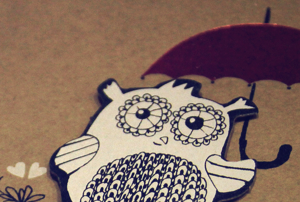
Teaser Image

Teaser Image

Teaser Image
Columns & Gutter
You can set the number of columns that will be displayed on all device sizes and apply different gutter widths or collapse the gutter altogether.


Small Gutter

Small Gutter

Small Gutter
Small Gutter
Media Align
You can align media above or below the title, left or right of the content or display it as a teaser at the top of the grid item.
Image Below

Image Below
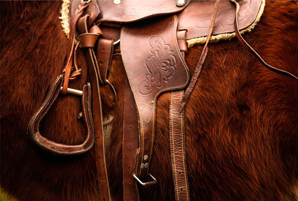
Image Below
Image Left
Image Left
Image Left
Image Left
Image Left
Image Left
Image Border
Images can be displayed as rectangles, with rounded corners or as circles. You can display social links inside the overlay.

Social Icons

Social Icons

Social Icons
Dynamic Grid
Create a grid whose items will arrange themselves fluently and seamlessly for a gap-free multi-column layout on all device sizes and filter items by name or tag.

Interior

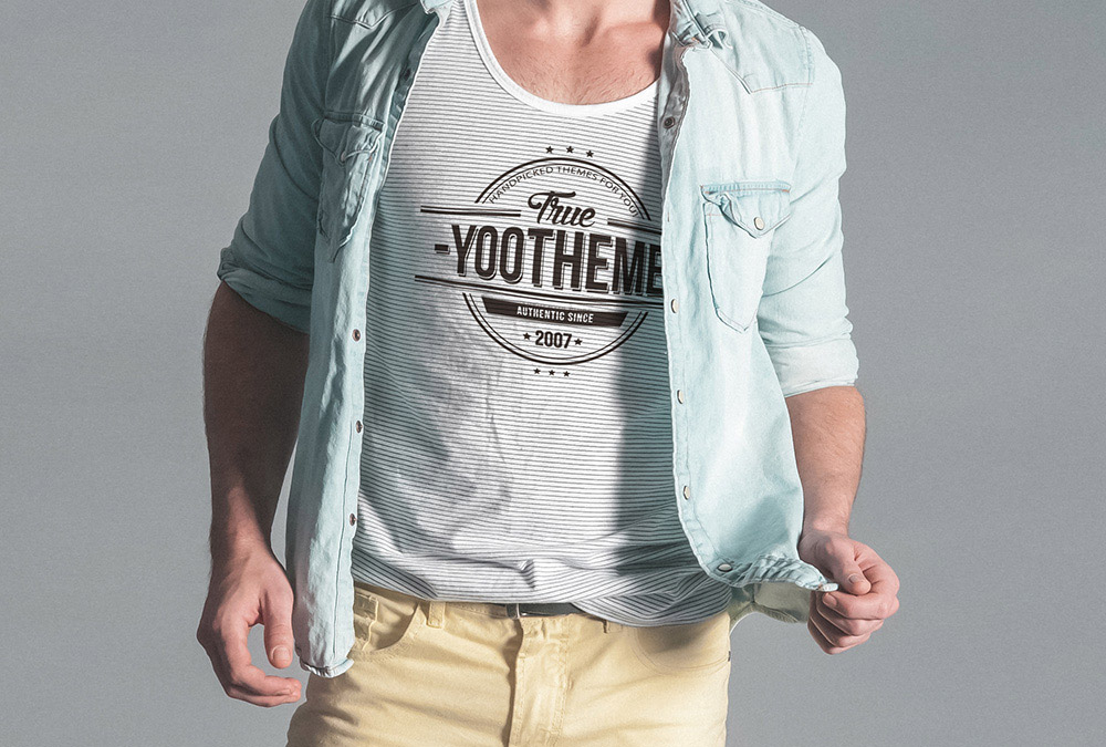
Library

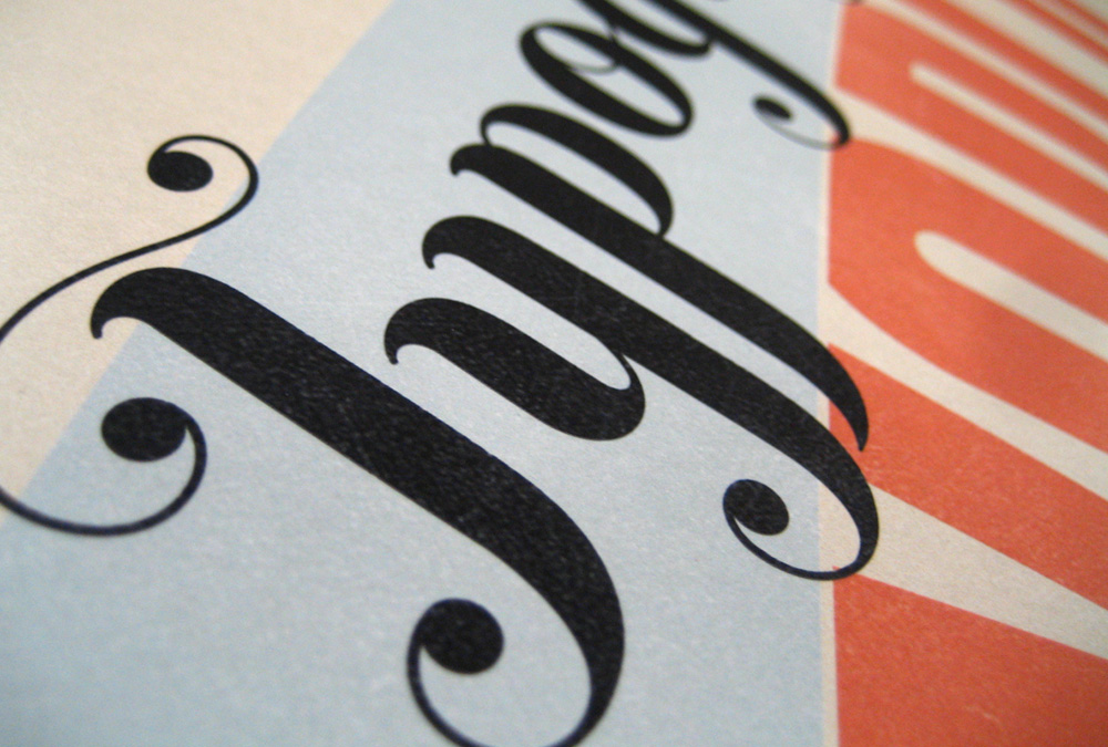
Vintage

Slides

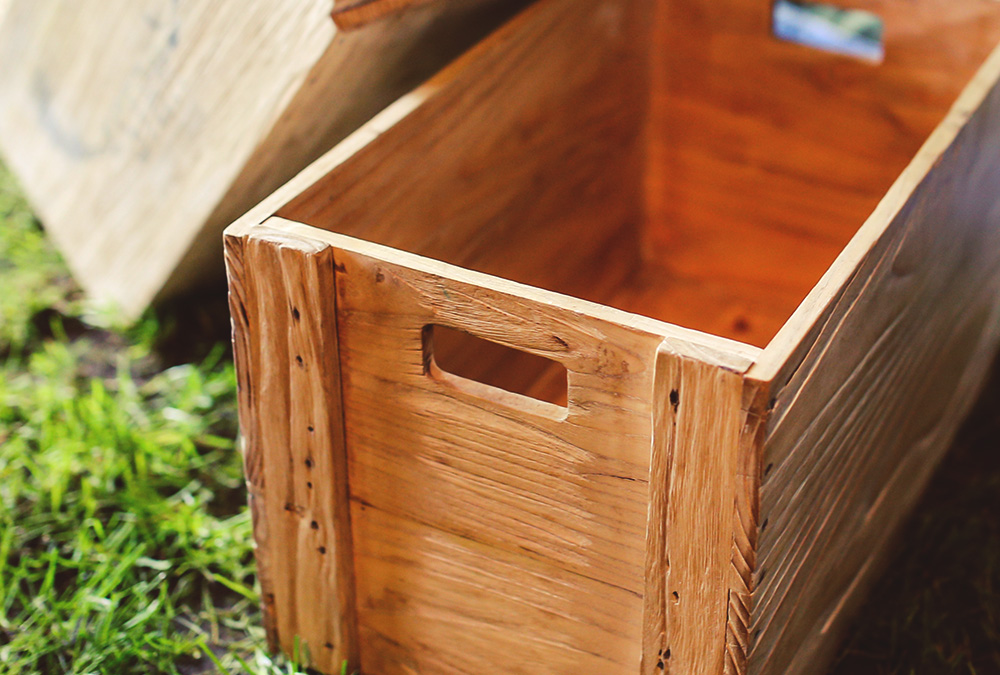
Tea Box
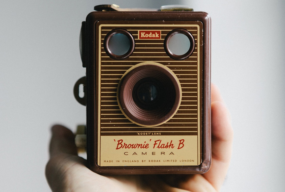
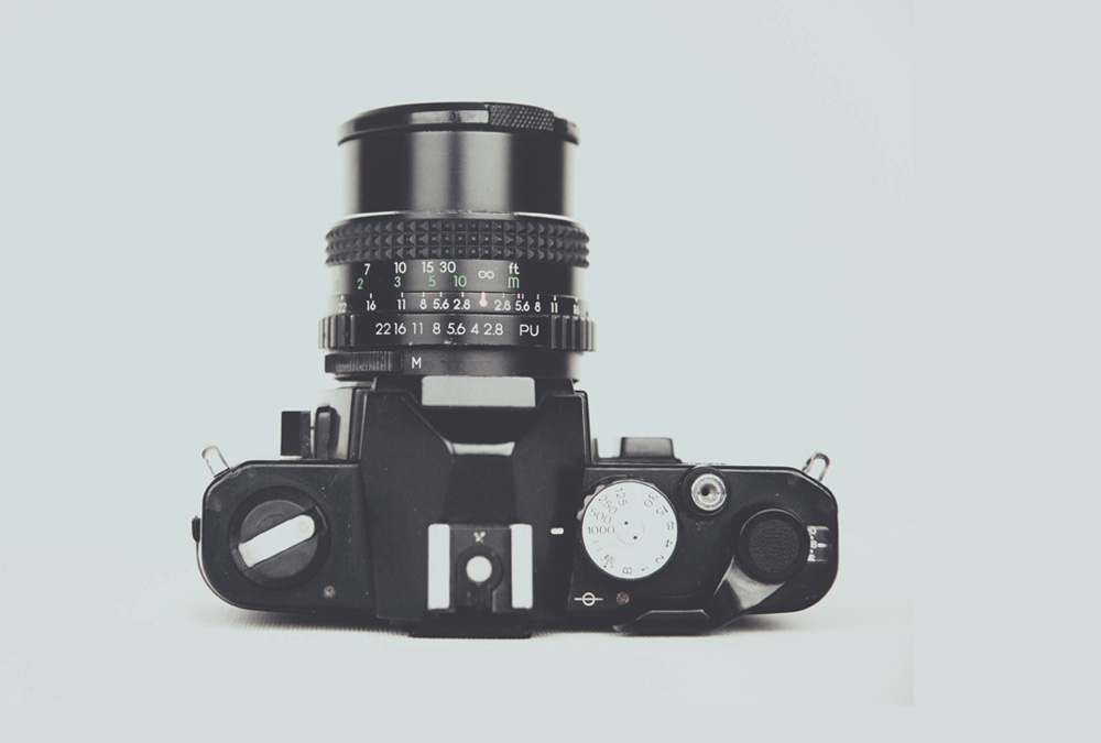
Camera

Museum

Living Room

Office


Panels and Badges
Set a background panel style for grid items and add a badge, for which you can also select different styles to set content off from the rest of the item.